4 Tips for Effective User Interface Design for eLearning
When you’re designing an eLearning course, how often do you think about the learner experience? And by learner experience, I don’t mean the learning content! When I say “learner experience,” I’m talking about the actual experience your learners have when interacting with your course.
It’s easy to neglect the learner experience when designing an eLearning course. The truth is, an eLearning course includes more than just learning content—it includes graphics, audio, and interactive objects. In addition to designing how your learners will retain the learning content (through good instructional design techniques), you must also consider how your learners will interact with your course (though good user interface design techniques).
When an eLearning course is hard to use or lacks intuitiveness, it becomes a barrier to your learner. Taking the time to make your course easy to use and navigate lets the learner focus on learning, rather than figuring out to use the course!
Here are four tips to help you improve your user interface design for eLearning.
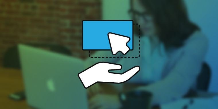
Provide a Clear Path Forward
Most eLearning courses require the learner to do something to advance to the next slide. This might be as simple as clicking the Next button or answering a question correctly. Although this might seem like a no-brainer, it’s amazing how often we, as eLearning designers, overly complicate the process!

Click to enlarge.
When it comes to user interface design for eLearning, make sure to provide a clear path forward. Look at each of your slides from the learner’s perspective, and make sure there is no question about action(s) the learner should take next. Is there a button the learner should click or something they must do? If so, make it abundantly clear by adding some on-screen text or stating the action in the audio narration. You can even use animations to direct the learner’s attention, as I show in this free webinar recording.
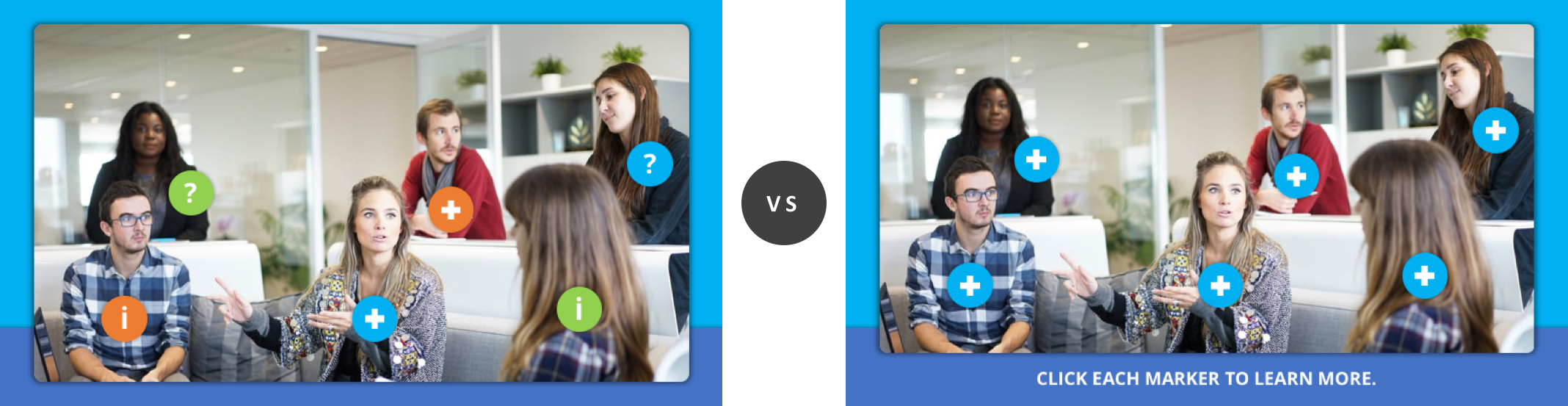
Keep it Simple
I’ve always been a big fan of simplicity in design. The funny thing about simplicity is how hard it is to achieve. It’s only after an eLearning course has gone through several iterations of design is simplicity ultimately obtained. Naturally, when you’re new to eLearning, it’s easy to overly complicate your course design—navigation might be clunky or there are several ways to advance from one slide to another.

Click to enlarge.
When it comes to user interface design for eLearning, less is more! It’s not always best to give the learner several options that accomplish the same thing. Look at the example above on the left. How many options does the learner have to navigate the course? If you built this course, the navigation might seem obvious to you; however, that’s not always the case from the learner’s perspective!
Be Consistent
Good user interface design works on a subconscious level. For example, let’s say you build a course with orange buttons. Subconsciously, the learner establishes that orange = button, and they expect that for the duration of the course. The moment you introduce a button of a different color, let’s say green, the learner’s subconscious is now forced to determine the meaning of this new color. If no discernable meaning exists, it can ultimately confuse and distract the learner.
Click to enlarge.
When it comes to user interface design for eLearning, consistency is essential. Although the color, shape, or placement of a button might seem insignificant, it becomes incredibly significant (and confusing) if the color, shape, or placement changes from one slide to the next with no explanation.
Test Your Work
The development of an eLearning course is a lot like engineering a piece of machinery—you have a lot of moving parts that must work together flawlessly. You don’t want to wait until you’ve delivered your course to your learners to learn that something doesn’t function properly!
When it comes to user interface design for eLearning, test your work early and often—it’s the reason all eLearning authoring tools have an option for previewing! When designing a highly-interactive eLearning course, get in the habit of previewing your work as you go. Does the course or interaction work as expected? What happens if you try to “break” the interaction or do something against the intended design? It’s through testing that you’ll discover “holes” or broken components of your course.
Taking the time to carefully consider how your learners will interact with your course, and ensuring that your course is easy to use, can help make it more effective and enjoyable. What other tips do you have for improving user interface design for eLearning? Share them by commenting below!


… graphics, audio – it also includes time, sizes of information chunks presented to the learner, eLearning course’s place among other, probably more core, work tasks, and everything else that’s usually overlooked when it comes to learner experience analysis.
Therefore it’s a topic worthy of discussing, but definitely the best discussion there can be, is data-based, so yeah – conduct test, people!